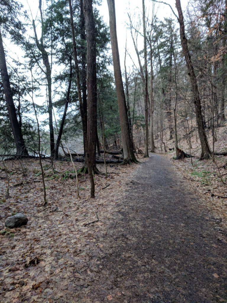
Trail 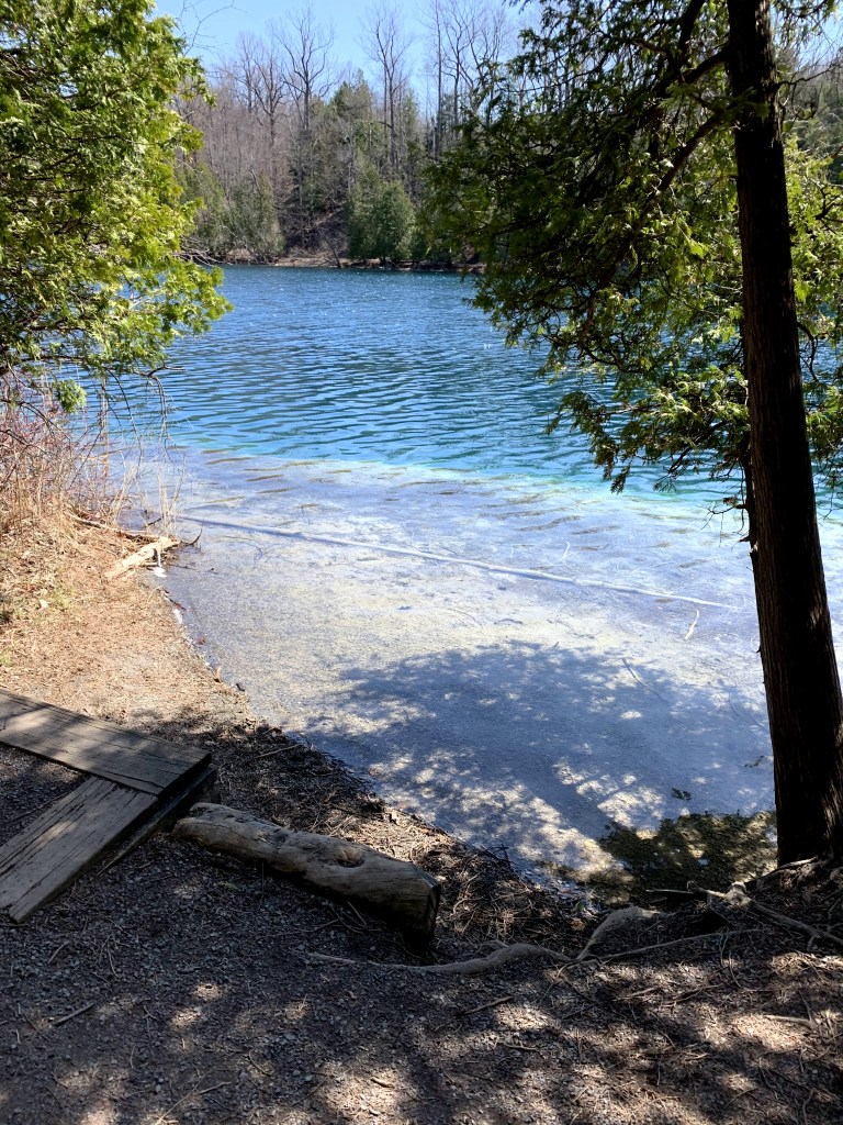
One of many beautiful trail openings with lake view. 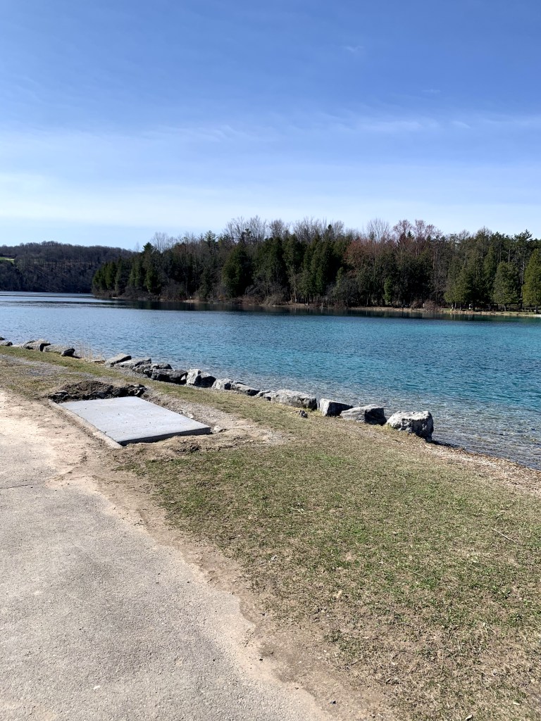
Open lake view.
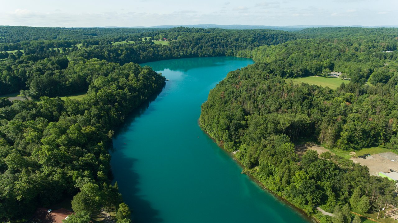
The setting is Green Lakes State Park located at 7900 Green Lakes Rd, Fayetteville, NY 13066. Situated 20 minutes east of the city of Syracuse, NY, this New York State park has become a well known destination which draws visitors from across the state and from across the nation. It is a very versatile park with campgrounds, two small lakes with paths around them, beach, golf course, restaurant all on the property. Signs and infographics fill every part of the park, and are especially prevalent on the lake paths, providing visitors with different elements of knowledge. In one of my visits walking around the lake, I gathered some graphics which represent examples of the different types of signs present.
Place Making
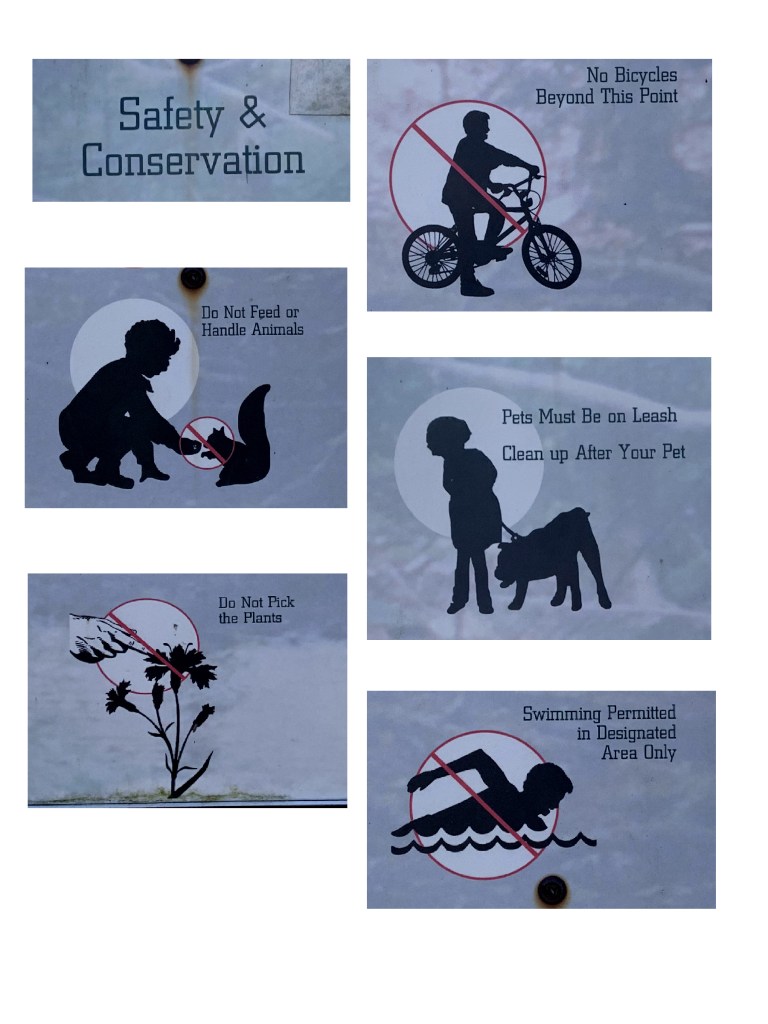
1a. The graphics. 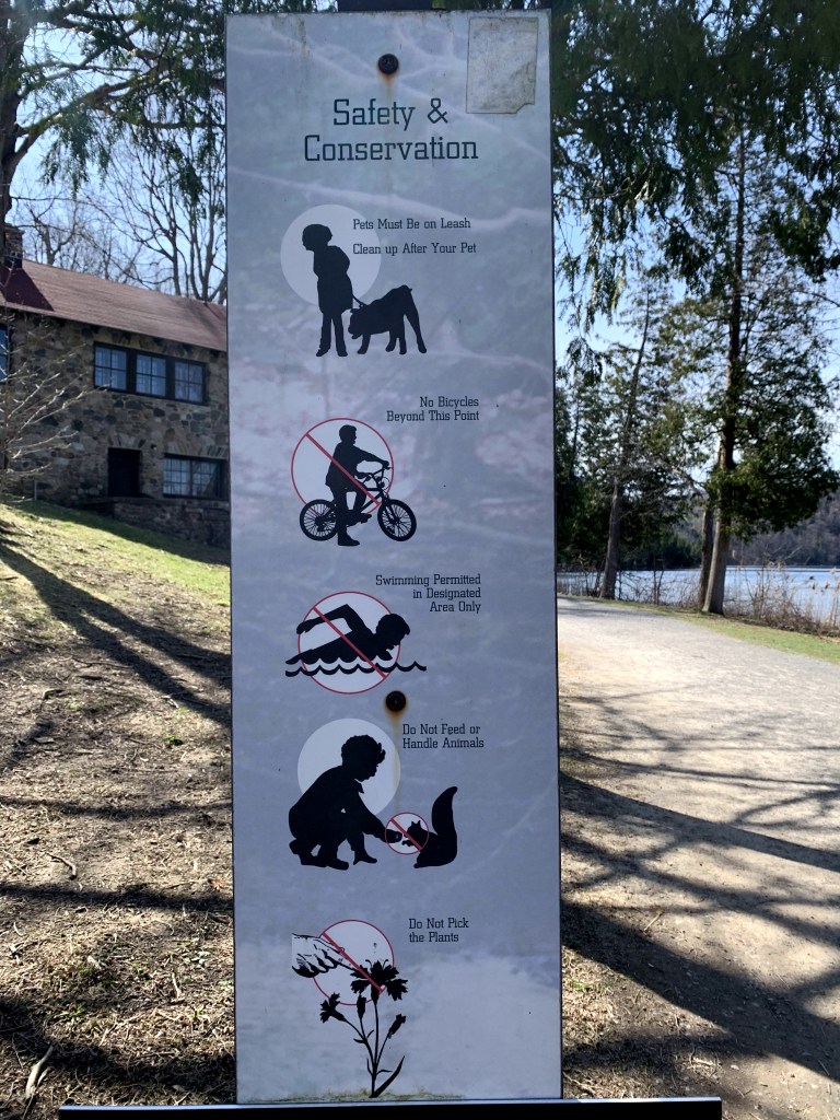
1b. The setting.
The lake trail has many signs on posts such as the one above (1b). I came across this one in particular at the start of the trail, near the parking lot. Picture 1b with background gives context as to where the sign is while 1a focuses on the graphics on their own. To me, this sign represents an effort of placemaking. Placemaking is an element of Environmental Graphic Design (EGD) which describes the power of a visual to “create a distinctive image for a site” (https://segd.org). Being one of the first signs that many visitors see, this sign, which is actually a collage of graphics, serves to set a precedent for the mission of the park as well as the ways in which guests should and shouldn’t act. The graphics are extremely simple but have a way of conveying exactly the message they are meant to without any unnecessary clutter. Using commonly recognized imagery of actions along with the universal sign for “no” (the circle with a line through it), passersby can easily understand what is expected of them in the park. To make sure the message is clear, each graphic is accompanied by a small caption however it is secondary to the more prominent images. Although I presume its main function is to enforce the rules, the collection of images chosen along with the title “Safety and Conservation” gives the sign more placemaking characteristics. Although more in depth information about the safety and conservation efforts are scattered around the park, this graphic provides an introduction to the “image” or character of the space in which they are entering. It shows that the park is very environmentally conscious and that there is a large focus on preserving the space, an effort that is expected to be respected by the guests. Through my previous, Dear Rome Data Projects (which you can see further down my blog feed), I focused on using graphics to present more detailed, numerical data. The graphic pictured however, serves as an example of how infographics can be used to convey much simpler information and also information that is qualitative in nature. A large skill set necessary for creating effective graphics is knowing your audience and their general level of interest in the topic you are trying to portray. In this case, the graphic is placed in a place where people are inherently on the move and may not have the same interest in conservation as the park officials and experts. In this case, the sign does a nice job of quickly conveying information to its mobile audience and not boring them with dense text about conservation rather just making them somewhat mindful of it.
Interpretation
2a. The graphic. 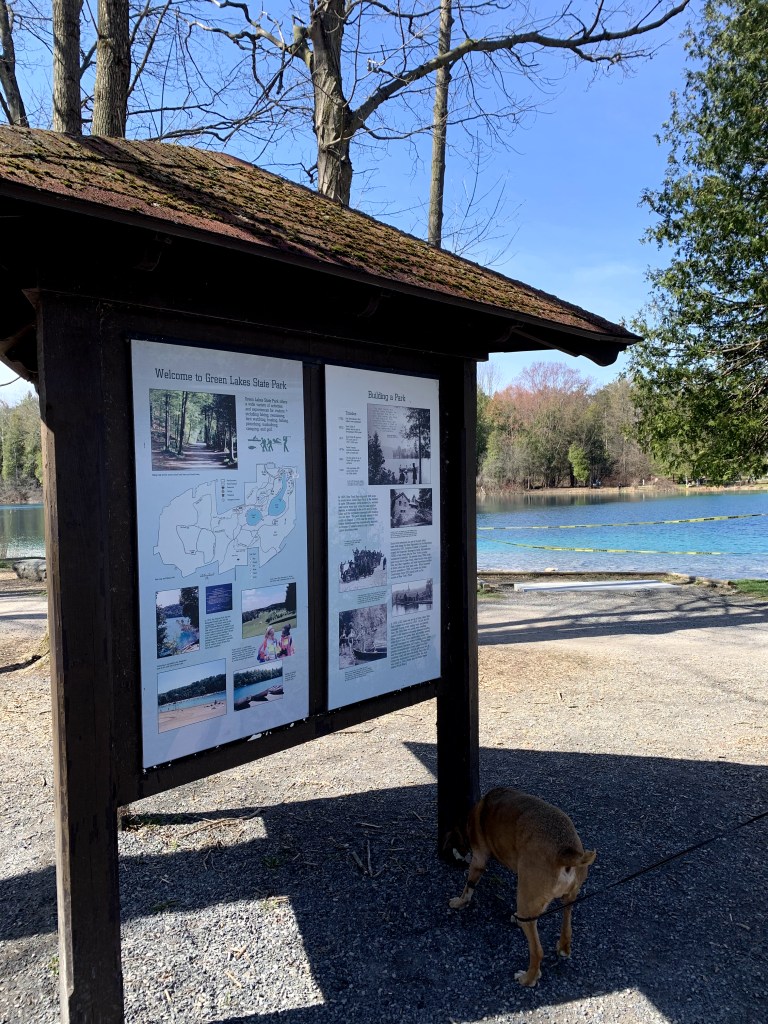
2b. The setting.
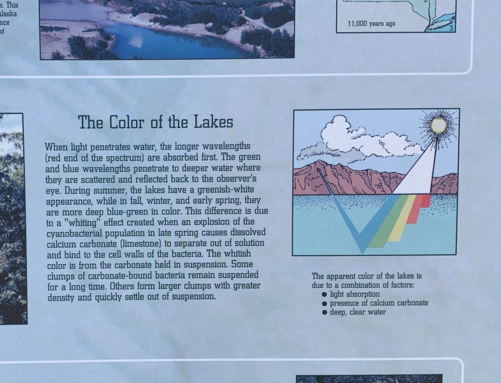
Another aspect of Environmental Graphic Design is interpretation which is described as the ability of a graphic to “tell a story about a site” (https://segd.org). Where as the first category, place making, seems to describe the characteristics of a place, interpretation seems to describe why a place is how it is, whether that be a historical or scientific explanation. In the case of Green Lakes State Park, everyone wants to know where it gets its name. The park’s namesake, a green lake at the center of the park measuring over 2 miles around, is famous for its greenish, teal color, and if you didn’t grow up going to central New York Public school you’re also probably wondering why it’s green. Being such a big part of the park’s identity, there are numerous informative graphics around the trail providing different pieces of information which answer this question. Picture 2a is the first instance I witnessed of this on my trip to Green lakes situated on a large information board which is pictured in 2b. With further reading of the accompanying paragraph, the viewer can get the full information on why the lake is green however without this text I do not think the graphic stands on its own well. The small text under the graphic gives some context to the graphic without reading the full paragraph but to the average person it may not actually do enough to show what is happening with the “light absorption” it lists as a reason for the color. To the average person it is hard to understand why the colors only start under the water line and the arrow pointing out into the air makes it hard to understand what is actually going that direction and where it is ultimately going. Additionally, it is hard to understand why the colored bars are all connected into one chunk but some are longer than the others. A final critique is that the setting in which the graphic is placed is not actually reflective of what Green Lakes looks like. This might be a small detail, but it makes the graphic seem removed from its actual intended subject.
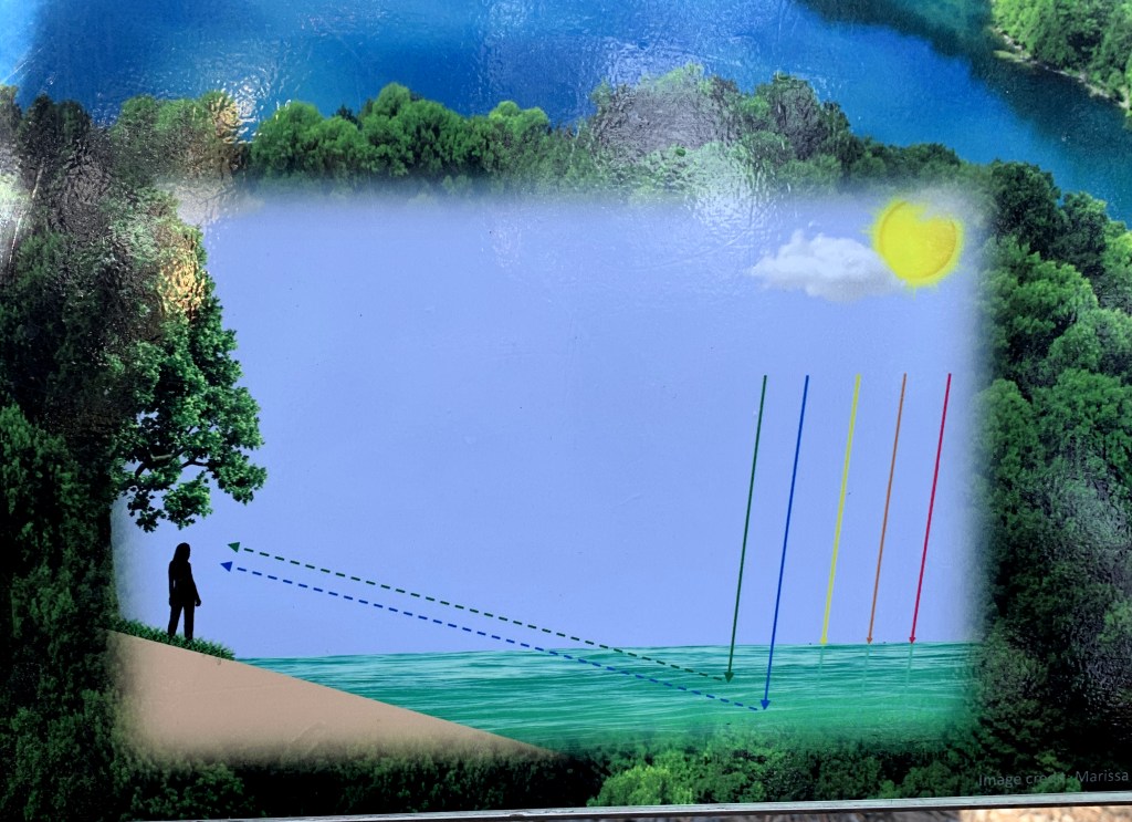
3a. The graphic. 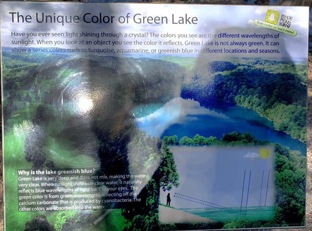
3b. Full graphic with text. (The rare sunshine made it hard to get a clear picture). 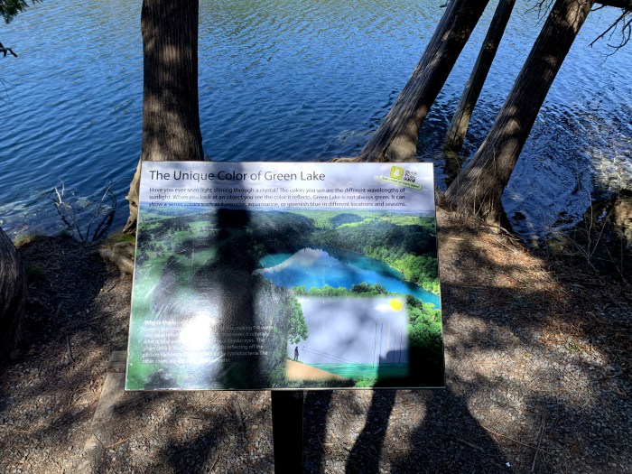
3c. The Setting.
Not far down the path, there is another example of a similar graphic (picture 3a) which I find much more successful. It is situated on its own plaque by a view of the water where you can really view the different visible colors (picture 3b/3c). Like the first example, this graphic still relies on the supporting text but I think it stands better on its own. The different colors of light are depicted on separate lines coming directly from the sun rather than changing under water which gives the viewer a better understanding of where the colors are originating from. It is much easier to see that the green and blue colors alone penetrate deeper than the others. Additionally the added arrows and the dotted lines connecting the blue and green colors to the persons eye gives context to why the colored lines are relevant to the color we see in a way the first graphic didn’t. Finally, I think the text is broken up much more manageable to support the graphic but to let it do most of the story telling.
Signage/Wayfinding
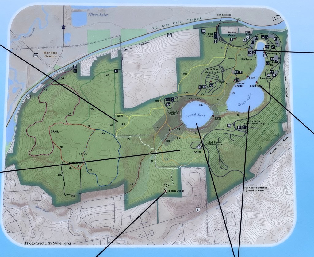
4a. Map graphic. 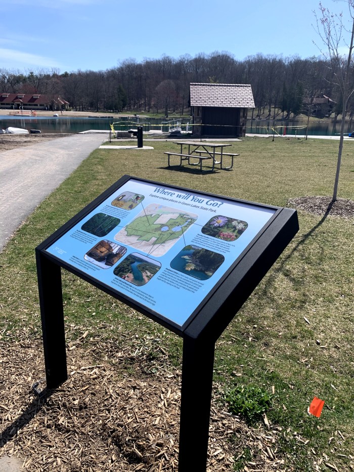
4b. The setting. 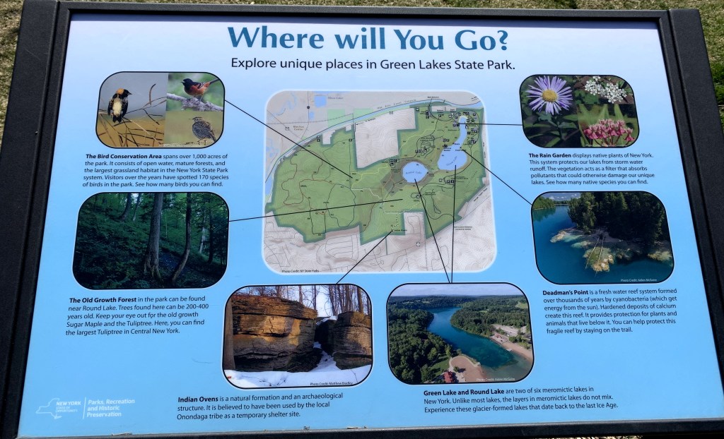
4c. Full graphic with text.
Wayfinding is yet another aspect of Environmental Graphic Design and may be the easiest to digest. It simply describes a graphic that “orients people and helps them navigate it” (http://segd.org). To me, when I first think of this I think of road signs but having been forced to really think deeper about this subject I realize that these types of signs manifest in many different ways, for example any type of map. This category is one of the most necessary and utilized types of graphics in many aspects of life. At Green Lakes, wayfinding signs manifest in many different forms from trail maps, to whole park maps and simple posts with arrows pointing in the direction of different amenities. Park maps are situated at almost every different entrance to the lake path, one of them being pictured in 4b. This sign is very interesting because there is a main graphic at the center of the piece (picture 4a) which reads like a typical map, but different places on the map are pointed out and emphasized using pictures and text (4c). Someone can use it simply as a navigation tool if they know where they want to go, but others can use it to get ideas of what to do and see if they’ve never been to the park. However, the addition of the locational information seems to be at a slight detriment to the strength of the map itself. First, I think the map should have an indication of where the sign is located. Visitors can certainly use their surroundings to get a feel for where they are but that might be hard for a first time visitor to orient themselves in the map setting. Secondly, the map has many symbols but no ;legend. Many of the symbols such as the bathroom and parking signs are recognizable but I have no clue what the letters on a large part of the map mean. The scale of the map compared to the surrounding pictures along with the title “Where Will You Go?” make me think that this is not meant to be a technical map rather a way to provide information about different places within the park. If that is the case, the map is a nice supplement to the infographic as a whole, but it does not necessarily stand strong as a main source of wayfinding signage for guests.
