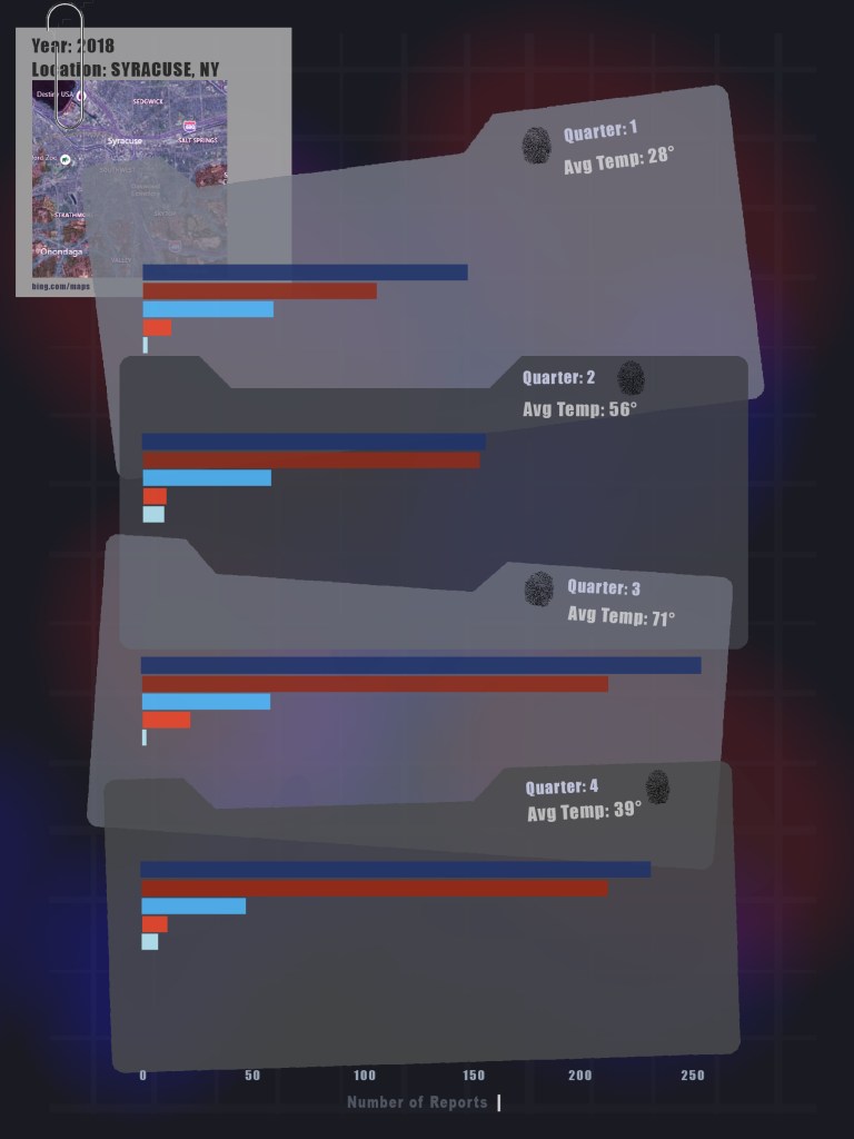
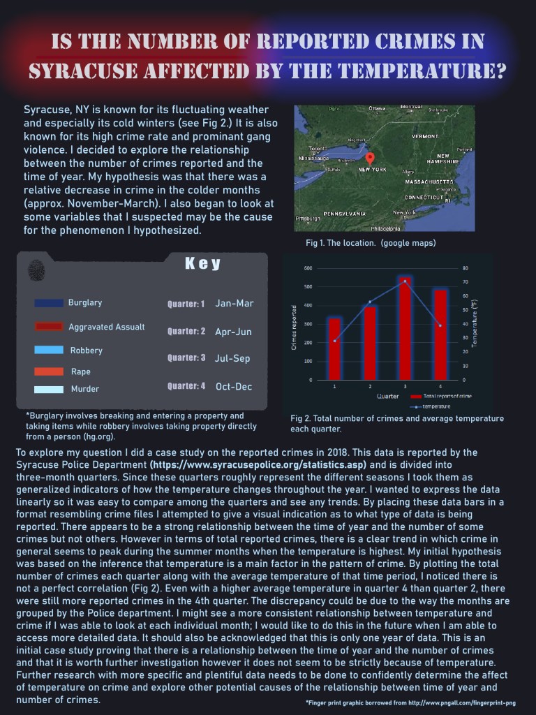
My time in quarantine has had me watching a lot of TV and my favorite genre is crime dramas. My final DRDP project was inspired by this facination with crime and specifically patterns of crime. I decided to run my own crime analysis on a subject matter close to home (literally). Syracuse, NY, my hometown, is known for its high rates of crime and violence. It is also known for its indecisive weather and long, brutal winters. Using data of the crimes reported in 2018 from the Syracuse Police Department, I explored if the number of crimes reported was affected by the temperature. I went in with the hypothesis that crime decreases when the temperature is colder and is most prominant in the summer months. The data from the police department is reported in three-month quarters which roughly line up with the different seasons. I determined that there seems to be a relationship between the time of year and crime although it does not seem to be strictly because of tempereature. See the graphic and key below for a full presentation of data and analysis.
Author: cdarcy99
Gathering Graphics at Green Lakes
Trail 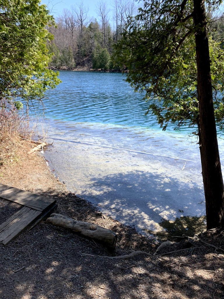
One of many beautiful trail openings with lake view. 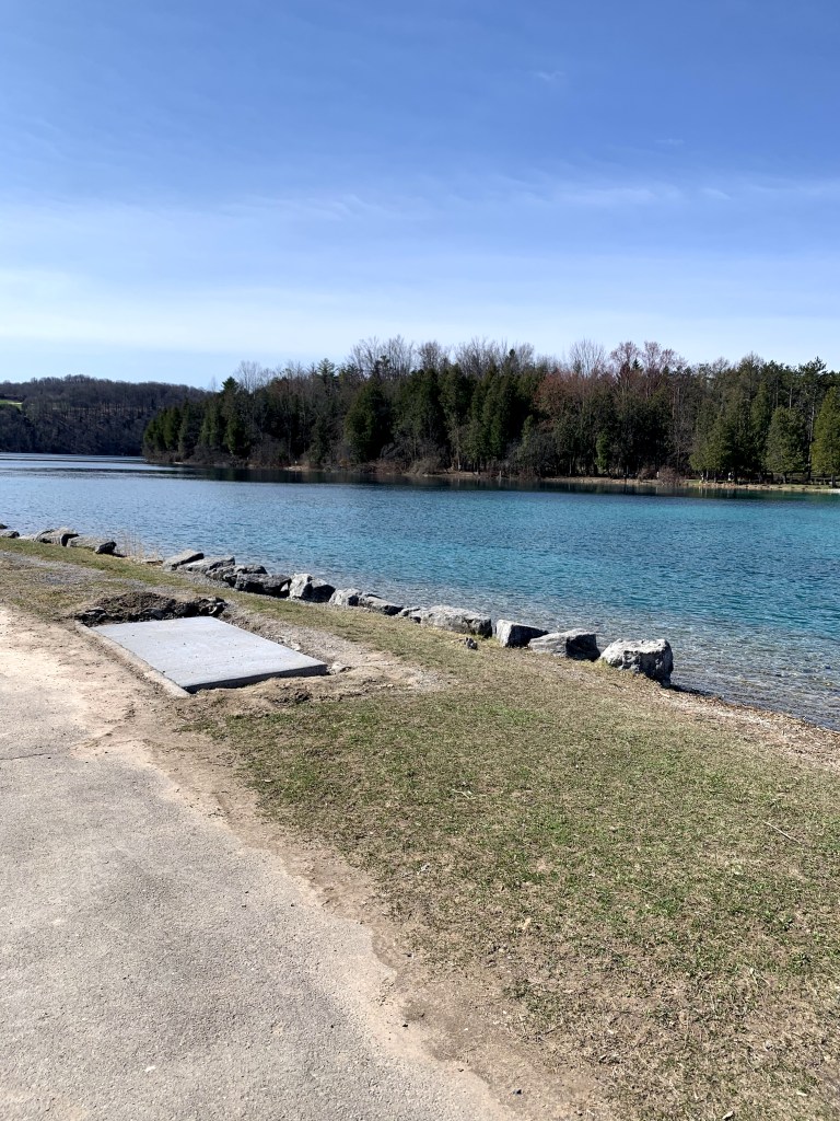
Open lake view.
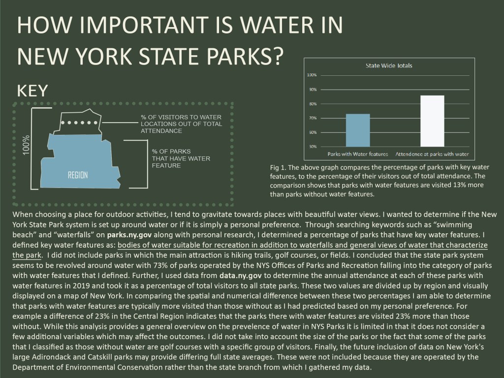
The setting is Green Lakes State Park located at 7900 Green Lakes Rd, Fayetteville, NY 13066. Situated 20 minutes east of the city of Syracuse, NY, this New York State park has become a well known destination which draws visitors from across the state and from across the nation. It is a very versatile park with campgrounds, two small lakes with paths around them, beach, golf course, restaurant all on the property. Signs and infographics fill every part of the park, and are especially prevalent on the lake paths, providing visitors with different elements of knowledge. In one of my visits walking around the lake, I gathered some graphics which represent examples of the different types of signs present.
Place Making
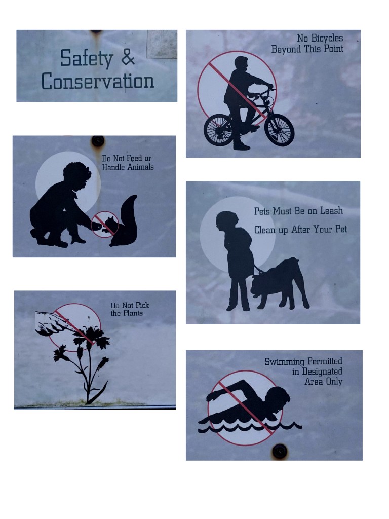
1a. The graphics. 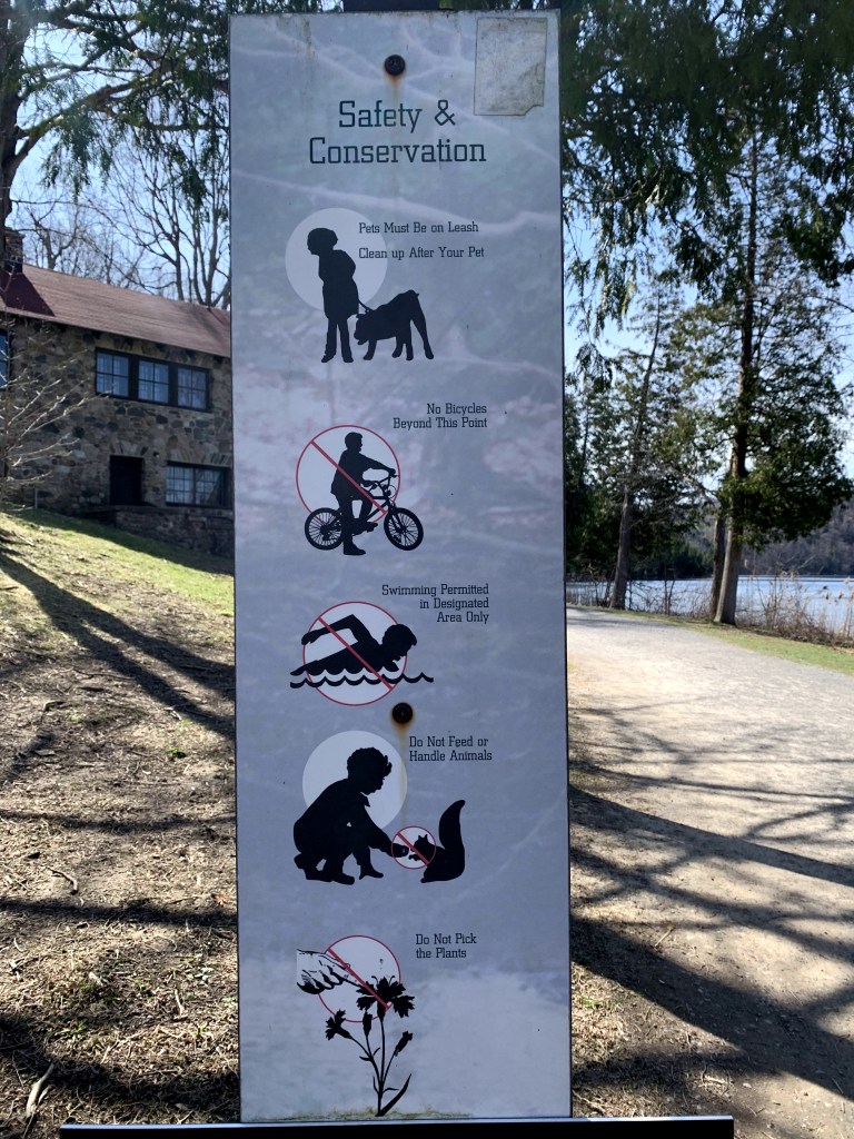
1b. The setting.
The lake trail has many signs on posts such as the one above (1b). I came across this one in particular at the start of the trail, near the parking lot. Picture 1b with background gives context as to where the sign is while 1a focuses on the graphics on their own. To me, this sign represents an effort of placemaking. Placemaking is an element of Environmental Graphic Design (EGD) which describes the power of a visual to “create a distinctive image for a site” (https://segd.org). Being one of the first signs that many visitors see, this sign, which is actually a collage of graphics, serves to set a precedent for the mission of the park as well as the ways in which guests should and shouldn’t act. The graphics are extremely simple but have a way of conveying exactly the message they are meant to without any unnecessary clutter. Using commonly recognized imagery of actions along with the universal sign for “no” (the circle with a line through it), passersby can easily understand what is expected of them in the park. To make sure the message is clear, each graphic is accompanied by a small caption however it is secondary to the more prominent images. Although I presume its main function is to enforce the rules, the collection of images chosen along with the title “Safety and Conservation” gives the sign more placemaking characteristics. Although more in depth information about the safety and conservation efforts are scattered around the park, this graphic provides an introduction to the “image” or character of the space in which they are entering. It shows that the park is very environmentally conscious and that there is a large focus on preserving the space, an effort that is expected to be respected by the guests. Through my previous, Dear Rome Data Projects (which you can see further down my blog feed), I focused on using graphics to present more detailed, numerical data. The graphic pictured however, serves as an example of how infographics can be used to convey much simpler information and also information that is qualitative in nature. A large skill set necessary for creating effective graphics is knowing your audience and their general level of interest in the topic you are trying to portray. In this case, the graphic is placed in a place where people are inherently on the move and may not have the same interest in conservation as the park officials and experts. In this case, the sign does a nice job of quickly conveying information to its mobile audience and not boring them with dense text about conservation rather just making them somewhat mindful of it.
Interpretation
2a. The graphic. 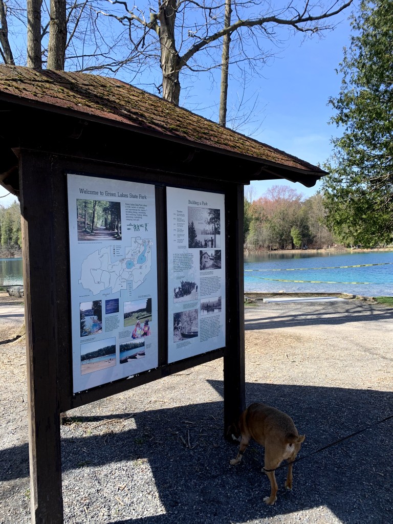
2b. The setting.
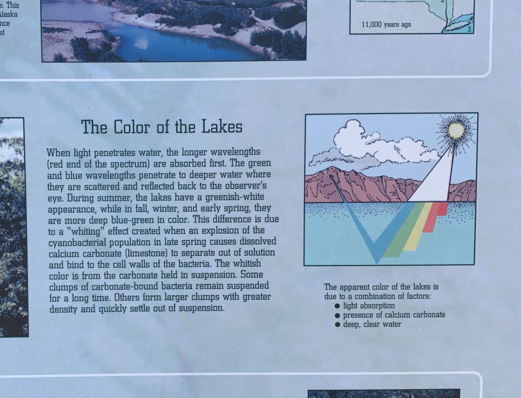
Another aspect of Environmental Graphic Design is interpretation which is described as the ability of a graphic to “tell a story about a site” (https://segd.org). Where as the first category, place making, seems to describe the characteristics of a place, interpretation seems to describe why a place is how it is, whether that be a historical or scientific explanation. In the case of Green Lakes State Park, everyone wants to know where it gets its name. The park’s namesake, a green lake at the center of the park measuring over 2 miles around, is famous for its greenish, teal color, and if you didn’t grow up going to central New York Public school you’re also probably wondering why it’s green. Being such a big part of the park’s identity, there are numerous informative graphics around the trail providing different pieces of information which answer this question. Picture 2a is the first instance I witnessed of this on my trip to Green lakes situated on a large information board which is pictured in 2b. With further reading of the accompanying paragraph, the viewer can get the full information on why the lake is green however without this text I do not think the graphic stands on its own well. The small text under the graphic gives some context to the graphic without reading the full paragraph but to the average person it may not actually do enough to show what is happening with the “light absorption” it lists as a reason for the color. To the average person it is hard to understand why the colors only start under the water line and the arrow pointing out into the air makes it hard to understand what is actually going that direction and where it is ultimately going. Additionally, it is hard to understand why the colored bars are all connected into one chunk but some are longer than the others. A final critique is that the setting in which the graphic is placed is not actually reflective of what Green Lakes looks like. This might be a small detail, but it makes the graphic seem removed from its actual intended subject.
3a. The graphic. 
3b. Full graphic with text. (The rare sunshine made it hard to get a clear picture). 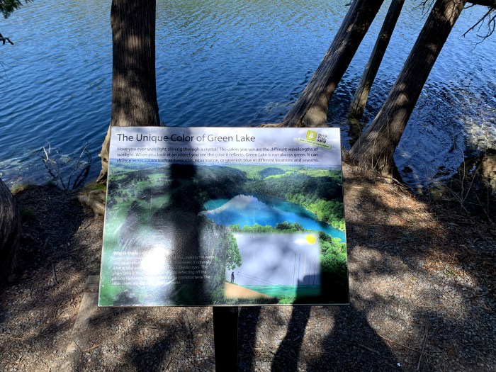
3c. The Setting.
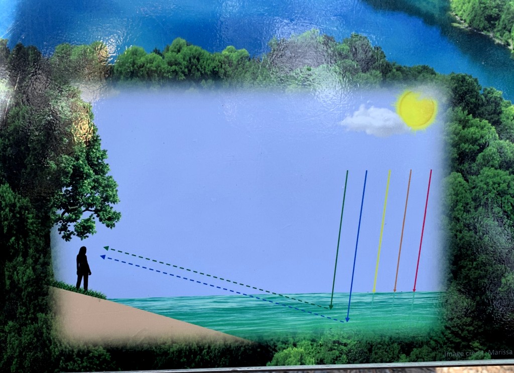
Not far down the path, there is another example of a similar graphic (picture 3a) which I find much more successful. It is situated on its own plaque by a view of the water where you can really view the different visible colors (picture 3b/3c). Like the first example, this graphic still relies on the supporting text but I think it stands better on its own. The different colors of light are depicted on separate lines coming directly from the sun rather than changing under water which gives the viewer a better understanding of where the colors are originating from. It is much easier to see that the green and blue colors alone penetrate deeper than the others. Additionally the added arrows and the dotted lines connecting the blue and green colors to the persons eye gives context to why the colored lines are relevant to the color we see in a way the first graphic didn’t. Finally, I think the text is broken up much more manageable to support the graphic but to let it do most of the story telling.
Signage/Wayfinding
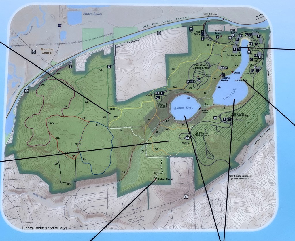
4a. Map graphic. 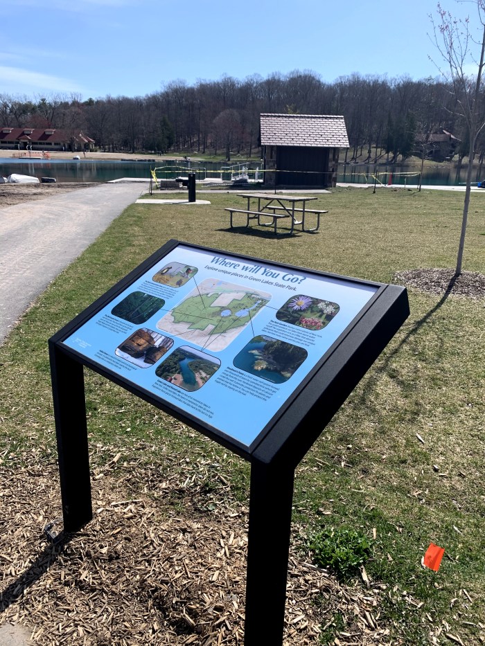
4b. The setting. 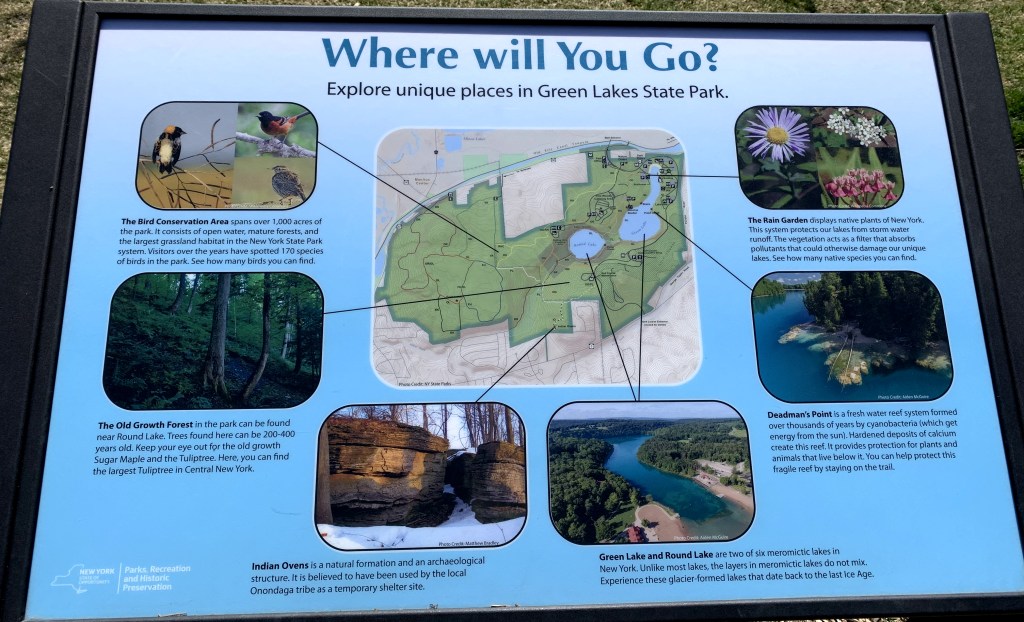
4c. Full graphic with text.
Wayfinding is yet another aspect of Environmental Graphic Design and may be the easiest to digest. It simply describes a graphic that “orients people and helps them navigate it” (http://segd.org). To me, when I first think of this I think of road signs but having been forced to really think deeper about this subject I realize that these types of signs manifest in many different ways, for example any type of map. This category is one of the most necessary and utilized types of graphics in many aspects of life. At Green Lakes, wayfinding signs manifest in many different forms from trail maps, to whole park maps and simple posts with arrows pointing in the direction of different amenities. Park maps are situated at almost every different entrance to the lake path, one of them being pictured in 4b. This sign is very interesting because there is a main graphic at the center of the piece (picture 4a) which reads like a typical map, but different places on the map are pointed out and emphasized using pictures and text (4c). Someone can use it simply as a navigation tool if they know where they want to go, but others can use it to get ideas of what to do and see if they’ve never been to the park. However, the addition of the locational information seems to be at a slight detriment to the strength of the map itself. First, I think the map should have an indication of where the sign is located. Visitors can certainly use their surroundings to get a feel for where they are but that might be hard for a first time visitor to orient themselves in the map setting. Secondly, the map has many symbols but no ;legend. Many of the symbols such as the bathroom and parking signs are recognizable but I have no clue what the letters on a large part of the map mean. The scale of the map compared to the surrounding pictures along with the title “Where Will You Go?” make me think that this is not meant to be a technical map rather a way to provide information about different places within the park. If that is the case, the map is a nice supplement to the infographic as a whole, but it does not necessarily stand strong as a main source of wayfinding signage for guests.
DRDP Group C
It was the second group of DRDP while in quarantine and these two weeks brought about some design exploation. Where as my previous graphics were characterized by a scientific precision asthetic, this time I explored a different style of graphic. This group is characterized by a style that I imagine as a more bubbly one used by companies and organizations to reach the general public and quickly and simply spread information. Still, both topics I explored were ones brought about by my own curiosity and relate to my personal habits and interests.

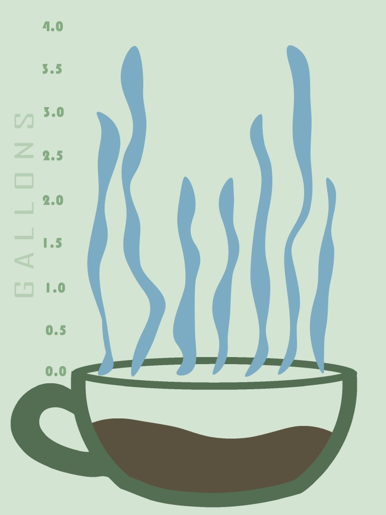
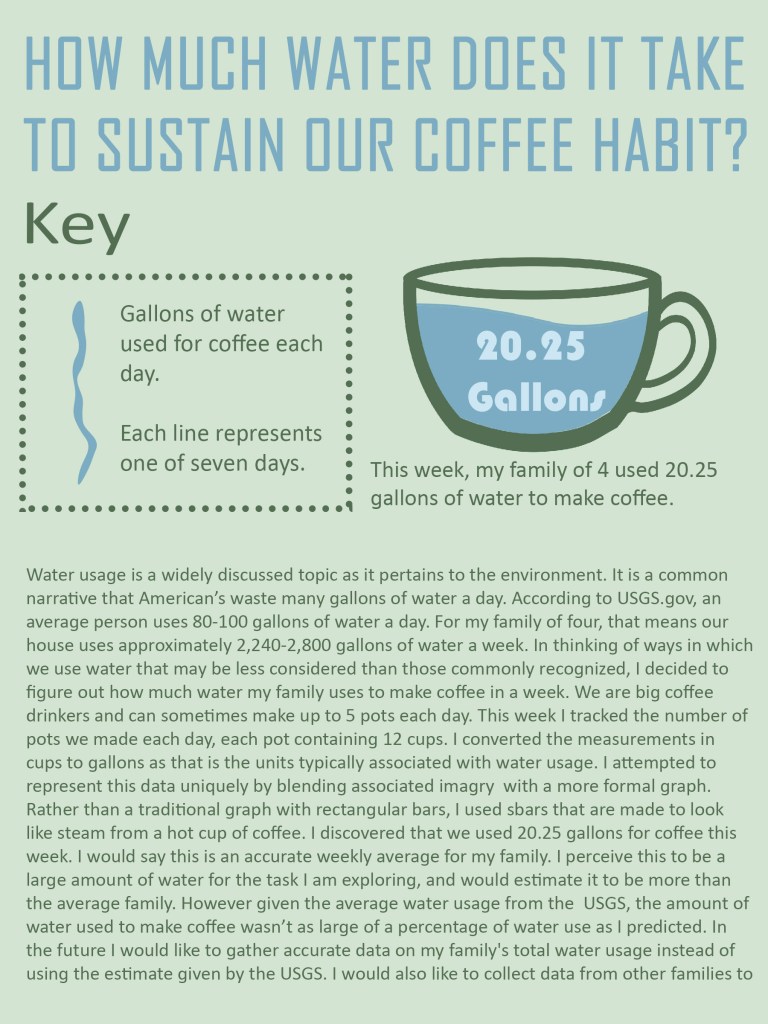
Inspired by my family’s insane coffee habit, I tracked how much water we use to make coffee over a period of a week. I concluded that this past week (which is a good gauge for weekly average) we used 20.25 gallons of water for coffee.
DRDP Group B
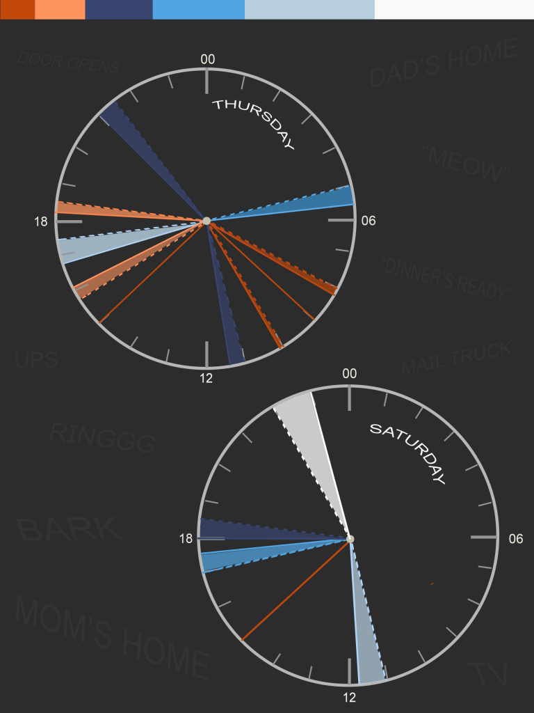
Group B brought some twists and turns comared to group A. With the unforseen circumstances of Corona Virus sending me home from Italy, DRDP is looking more like DRQP. The Q stands for Quarantine. The two weeks I spend in voluntary quarantine and the following days I’ve spent social distancing have been the inspiration for this pair of graphics. To make it more interesting this time around and challenge my infographic repertoire, decided to run them more like experiments with preconcived hypotheses. Keep reading to see how they went.
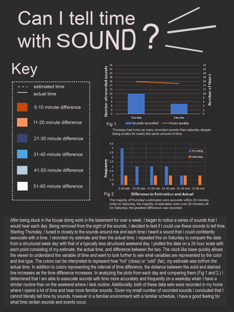
Can I tell time with sound? No, but I do know my routines! Follow the graphic below to see how I came to this conclusion.
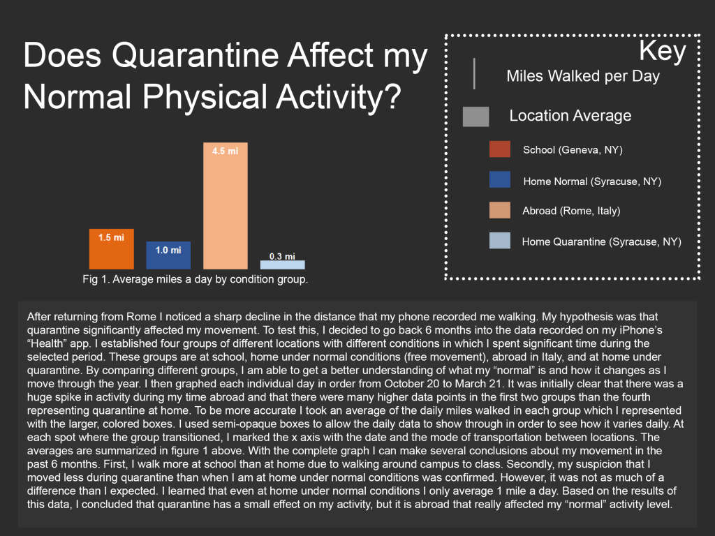
Does quarantine affect my “normal” physical activity? It’s complicated!! Read why below.
“The Truthful Art” Reflection
In The Truthful Art: data, chart and maps for communication, Alberto Cairo presents techniques for effective data analysis and synthesis as a tool of communication. He starts by discussing the most basic types of statistics that are used to draw conclusions from data; mean, median, mode and range. His goal isn’t to give a lesson on how to calculate these statistics, rather how to use them to convey the most truthful information in the best way possible. Cairo describes these simple statistics and the graphs that come from them as a basing point, not necessarily for viewers, but even for those conducting research to get a better understanding and inspiration for further research and also for constructing infographics. This part of the reading really resonated with me because it completely changed the way I thought about graphs. A graph does not need to be the final product, rather graphs can be just the beginning in diving deep into research and design. This was one of the biggest takeaways I gathered from this reading that will completely change the way I approach data design as a process rather than simply a destination.
From looking at graphs as a tool for the data collector, Cairo shifts to discussing graphs as a tool for presentation and communication to others. He suggests how different styles of graphs are more successful at displaying certain types of information and levels of detail than others. From the basic mean, median, and range line graphs, Cairo provides examples of how they can grow in much more complex manners such into range charts, strip plots, and bean plots. With presentation in mind, he stresses the importance of truthfulness and completeness of graphs and their connected message. Graphs can be deceitful and taken out of context or create false image of correlation where there really isn’t any. Although some may purposely try to deceive an audience with incomplete information, I think a lot dishonest graphics come from innocent miscommunication or for people who simply don’t know how to present so much data in a single graphic. From a personal standpoint, I sometimes struggle to find ways to tell the full story and not create clutter. Cairo teaches people like me new types of graphs and techniques to do so. For example horizon charts, heat maps, and scatter plot matrixes can all be used to display more complex data in a legible way.
Cairo also discusses the importance of the artistic side of displaying data. He debunks the notion that graphs are boring and unattractive, showing how they can become a form of art in and of themselves. On page 37 Cairo says, “Aesthetics, playfulness and the exquisite care for typography, color and composition are as important in artistic visualization as they are in the presentation of the analytic results.” For me, it was very inspirational to see how colors and shapes are implemented into graphs to create products that look like works of art. This got me thinking about how I can morph the two in my data design. Art does not have to be abstract to be beautiful, rather it can be derived from science and still be aesthetically pleasing and effective. On the contrary, graphs don’t have to be completely scientific to be accurate and legible, they can also be designed with aesthetics and art in mind. I found this article as a whole to be incredibly useful in informing my data collection and analysis as well as my data presentation.
“Envisioning Information” reflection
Complexity and confusion are two contrasting concepts often used in describing information design. Confusion, characterised by clutter describes a chaotic and ineffective display of information. “1+1+3 or more.” Artist, Joseph Albers developed this saying to describe how chaos can easily be created when different elements interact in may more ways than the artist intended. As a simple example, two black, parallel rectangles on a white background create an additional visual of a white stripe.
On the other hand, complexity describes a rich display in which there are different elements working together to convey information clearly and understandably to the viewer. There is a fine line between complexity and chaos, so how can designers achieve the more desirable effect? The answer is layering.
In Envisioning Information, author Edward R. Tufte many techniques for effective layering in information design. He describes design elements such as color, lineweight, value, texture, and shape to create effective complexities. However, the real value is on how designers layer these different techniques. As we know from Albers, it is important to have intention behind not only each individual element, but the relationships among them. For example, a strong border or grid around information or too much color in a composition can take away from what should actually be the focus. It becomes important, then, to create a sort of hierarchy of elements with the most meaningful information being the most prominent.
I viewed this article as almost a “tutorial” in creating effective graphics. I will admit that I have sometimes felt extremely overwhelmed by infographic design and design in general. In the past I have viewed design as a given gift that can’t be taught; you either have “the eye” or you don’t. This article proved to be almost a breakthrough for me in not only my understanding of design, but also how to actually implement that understanding into my work. Although you still have to trust your own gut and have some sort of an eye for design, it is comforting to me that there is almost a sort of science behind design and that it is something that can be learned.. After I read this article, I tried to implement more complexity into my own infographic design. By playing with value, color and sharpness, I attempted to create a hierarchy of different layers to best convey my data visually without relying as much on explanation. However, even given this newfound understanding, my lingering insecurity leaves me with some questions. Where is the line between chaos and clarity, confusion and complexity? Is it a fluid line, having different meanings to everyone? How can you truly know how your design will be perceived by different people?
Dear Rome Data Graphics
In the past few weeks I have been engaging in a project my professors call “Dear Rome Data.” Each week there is a new theme to guide data collection around the city. After the data collection period, I put together a graphic and attached data summary to convey what I had discovered.
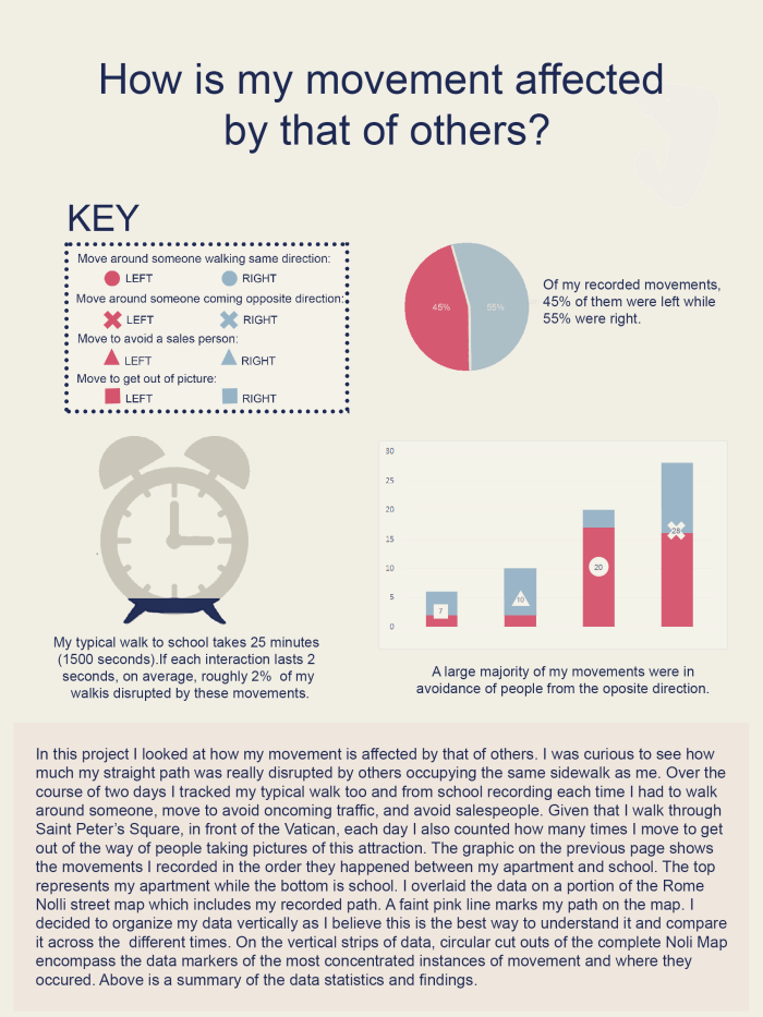
Week 1: Mapping movement
How is my movement affected by that of others on the sidewalk?
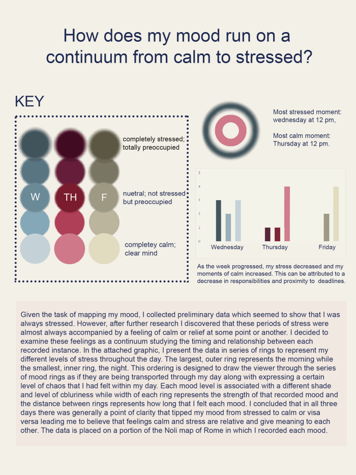
Week 2: Mapping and Mood
How does my mood run on a continuum from calm to stressed?
The right to information?
The following is a reflection and response to an exerpt from “Information Graphics” by Rendgen.
Graphics have been used to convey information for many centuries. From historical maps depicting extra information such as religious boundaries, to scientific graphics such as anatomical theories and abstractions, the need to convey information has long been explored. In today’s age with an ever growing abundance of available information, the need to synthesize this data is also growing. There has long been a debate at the core of information graphics that questions the relationship between design and facts. Scientists and statisticians had often assumed that “beautiful graphics tell lies.” While, on the other hand, designers and those in creative fields often put more emphasis on the aesthetics of the graphic. Within these two fields, (artistic and scientific) statisticians, designers, scientists, journalists and entrepreneurs alike, information graphics manifest in many different ways. However even among differing fields, the last ten years has brought about a growing common ground. The book “Information Graphics,” presents views from professionals in these different fields which demonstrate how their views may not be so different after all. Starting with the architect, Richard Saul Wurman is famous for his data design language, LATCH; standing for location, alphabet, time, category, and hierarchy. In studies of information storytelling, Wurman recognized the need for a sort of design language that would allow for a better understanding of the data being presented. Next, the journalist, Simon Rogers, details a growing demand by the public for legible data and information. He attributes this to the sheer growth in available raw data. Graphics allow journalists to visually portray data they are already writing about in a desirable way to their consumers. In the journalist realm, graphics tend to be less artistically abstracted as to be understood by more people. And finally, the scientist, Paolo Ciuccarelli. Ciuccarelli, even more than the other two professionals, explicitly demands the importance of the public in how information graphics are created. Although, in the past, a growing distance between scientists and the public prevented the crossover of information, the two realms are becoming increasingly connected. Scientists rely on the public for funding and political support while the public desperately desires the information that scientists cultivate. A common theme among these three selections is the need to make information graphics accessible and legible to the public rather than simply to experts. I agree that in some cases, information graphics should be more geared towards the general population for capitalistic reasons as well as to cultivate an informed society. But, the general population is filled with experts in various fields that have the capacity to understand more statistically or artistically complex graphics. So I challenge the arguments of these selections, just because society desires more information, is it the experts job to constantly cultivate it for them? In some cases, yes, however graphics do not need to be made to be understood by everyone. In my opinion, successful information design is based on knowing one’s audience and arena. I leave you with one question; do we, as a society, have the right to information?
“Dear Data” Reflection
Georgia Lupi is an Italian native working in New York City as a private information designer. Although her background is in architecture, her interest lies in data and how it can be used to understand human relationships. Combining her design background with her love of data, Lupi started a company in Milan, Italy that creates “design solutions to get people closer to data” through graphical creations. In 2013 Lupi met Stefanie Posavek, another player in the relatively small discipline of information design from London at the annual EYEO Festival. The EYEO Festival is a cross-disciplinary celebration of technological innovation at the hands of artists, coders, data designers, researchers and beyond (eyeofestival.com). While Lupi had expressed that although there is value in hand drawing, her company works 100% digitally, Posavek discussed her keen interest in hand drawing and creating three-dimensionally. At the 2014 festival, the two met for the second time and decided to collaborate on a project they named `Dear Data ” in which they agreed to get to know each other through data data driven post cards that they would design and send each week. These postcards crossed the disciplines of design and data and tackled subjects from movement, to love, to drinking habits, and personal strengths and weaknesses. In 2015, the duo came back to the EYEO Festival, this time as keynote speakers discussing their experiences with the project. Although the speech was a long, 50 minutes, each new subject the women discussed surprising peaked my interest and inspired me for the future of my data design.
The first thing that grabbed my attention in their talk was the learning curve that came at the beginning of the project and even pursued long into it. They discuss how in the first week they thought they were going to take data solely by hand in small notebooks as they traveled through the day. Quickly, they realized that this was chaotic and unsustainable for their lifestyles and decided to incorporate the use of technology by keeping data in their iphone notes and in various apps. The next week’s topic was movement throughout the city for which the women used an external app to automatically collect data. This was the first and last time they used an external data collector as they both agreed it felt impersonal. In the following week the women decided to collect data on their “thankyous” however this week also brought up its own problems. Because they knew they were trying to collect data, it made them more conscious about when they used thank you and made them think more about saying it before they actually did. This was a problem because the data may not have reflected their actual, subconscious habits of saying thank you. As a student studying information design, seeing these professionals still working out kinks as they try a new project reassures me that the value and success of a project lies not only in the final product but in the process and through some failure. Going forward after hearing these women, I have the mindset that it is more valuable to try new things and potentially fail than to stay in my comfort zone and create uninteresting or thought provoking projects.
Something else I was very intrigued by is the way that the two women created such different postcards even given the same general topic. Through the collection of postcards after maintaining the project for forty weeks, it was clear that Posavek was much more colorful and radial while Lupi was much more technical, detailed and complex drawing on her architectural roots. This is one example of how much these women were able to learn about themselves and each other throughout this process. They talk about how their Dear Data project made them much more observant and aware of themselves, their habits and also their surroundings. At one point Lupi said that through data, she had learned more about Posavek, whom she’d only met in person twice, than she did about some of her closest friends. In concluding how this project had changed them and their relationships, Lupi said that data can be “humas, delicate, slow and worm.” Kosavek added that data is not the end of the story, rather it is the beginning. By this I think she means that data should be a point of departure for further thought about something. For examples in this project specifically, the results of their data collection about their bad habits is not simply a set of observations it is a way for them to really self reflect and see how they can work to better themselves. Seeing data as such a human concept rather than solely scientific and mathematic as a first time information designer makes the task seem much less daunting.
There was one moment in the speech that particularly got me thinking and left me with questions. The women talk about the occasional data voids in which they were preoccupied in either good or bad ways and forgot to record data. But in the weeks where their research revolved around their personal habits, does the so called “data void” actually become data in and of itself? In my opinion the lack of data collected (with an explanation as to why) can say just as much about a person as actively recorded data can. What are your thoughts on this?
Assignment 3: Unity/Variety, Weight/Gravity, and Scale/Proportion
Unity and Variety
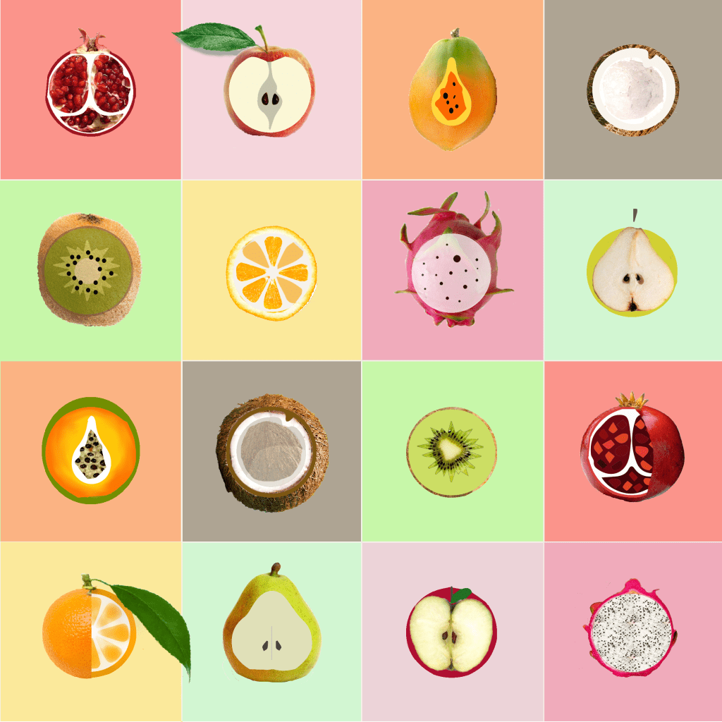
In my first design I didn’t stray too far from the layout of the original canvas. I took the images of fruit quite literally but used different textures and images to make it visually interesting. Proximity and similarity of pieces with the same idea emulate unity while the different construction of each fruit bring in a sense of variety.
Weight and Gravity
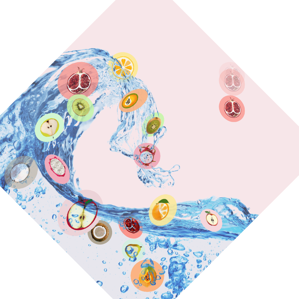
In the second adaptation I attempt to show a sense of gravity and weight (or weightlessness). While my first design is rather two-dimensional with the fruit appeared to be suspended in midair, when I imagined the topic of gravity, I imagined all those suspended fruits falling. From that, the idea of the way water sloshes when it is moved or poured into a bowl inspired my design. The different positions, orientations, and opacities of the various fruits imply different weights while the different movements of the piece create the feeling of gravity and weightlessness.
Scale and Proportion
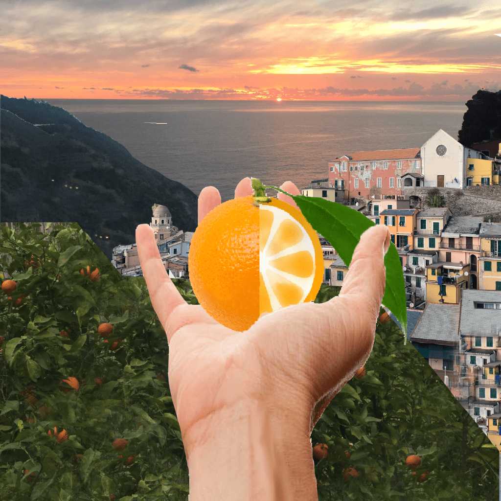
Inspired by a recent trip to the hillside towns of Cinque Terre, Italy, I wanted to invoke an incredible sense of layering and terracing in this piece. In the 5 towns of Cinque Terre, steps of colorful houses adorn the few streets and between them, high mountains. I used scale to imply depth along with different layers to evoke a sense of dimension. The large hand in the foreground is intended to make the viewer feel as if this design could be an actual site from their point of view.
