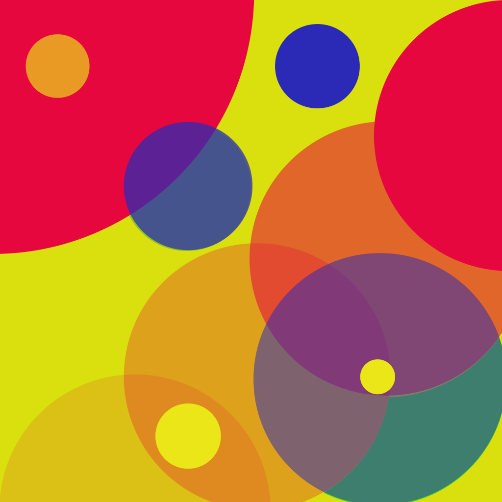
When given the task of exploring color, I chose to work with the three primary colors both individually as well as seeing how they interact with each other. I began with yellow in the background because as the lightest color it seemed like the most logical one to build off. Using the existing circles, I adjusted not only the fill color but also the opacity. For each primary color I tried to have three different hues which I made by adjusting the opacity. There is at least one solid, darker circle of each color with other circles of varying hue and opacity throughout the composition. While working with the primary colors was an important motivation for my design, the other half was seeing how they mix. By overlapping different colors and playing with opacity I was able to see how secondary colors come to life.
Lines
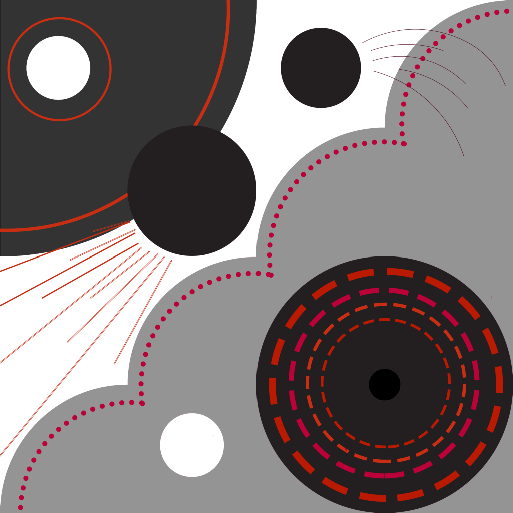
The above composition is an interpretation of how lines can be used to evoke different understandings of motion, or lack thereof. When creating this design, my motivation lies more in exploring the function of lines rather than in creating something very visually attractive. I filled the existing circles and shapes with tones of grey while I made all the lines red as to focus on them. I started with the short, solid lines off the circle to convey a forward movement. To me I thought of the composition as a sort of space scene with the circles floating as stars or planets. To me, the lines behind each circle, and their path can convey a certain sense of motion which I wanted to explore in this piece. Secondly by using multiple rings of dashed lines and changing their size I attempted to create an inward, spiraling movement, like that of a black hole. Next, I explored the function of a solid line in the top left circle. To me, the long, solid line really grounds an object and creates a sense stillness unlike the other others. And finally, I see the dashed line as in between static and dynamic. I thought of it like a perforated line on a paper, currently still attached as one, but could become mobile at any given point.
Text
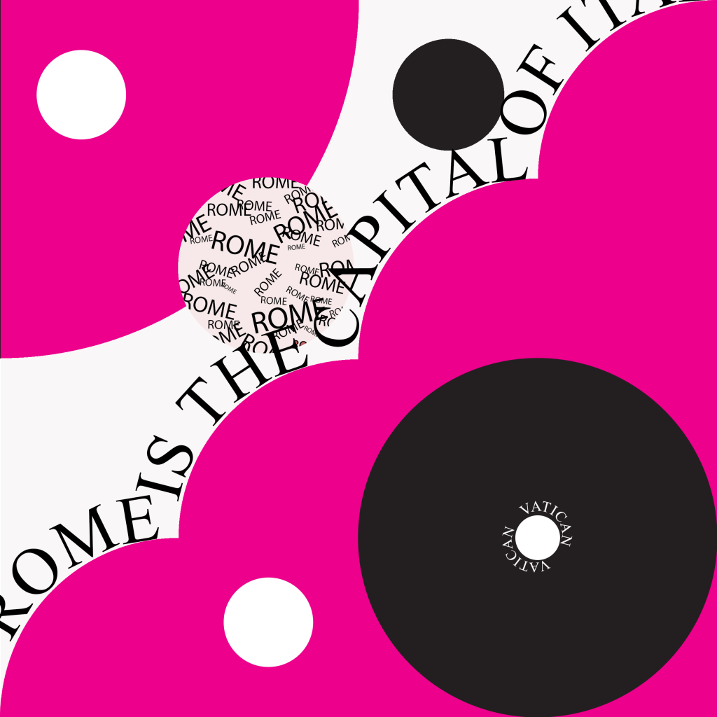
Like the “lines” composition, my text composition is more of a canvas for trying different techniques and less of a cohesive piece. First, I experimented with a technique of filling a circle with text but still having clean edges. To me this is an interesting design because shapes are usually defined by their relative value but text can also be used to create an implied shape. Secondly, to me the long, scalloped edge would not be done justice with individual words, but rather a full sentence preserves its continuity. Finally, the word “Vatican” around the small white circle was both a design choice and a practice of technique. I chose to write Vatican because I saw the small white circle as being individually contained within the bigger, black circle as the Vatican is in Rome.
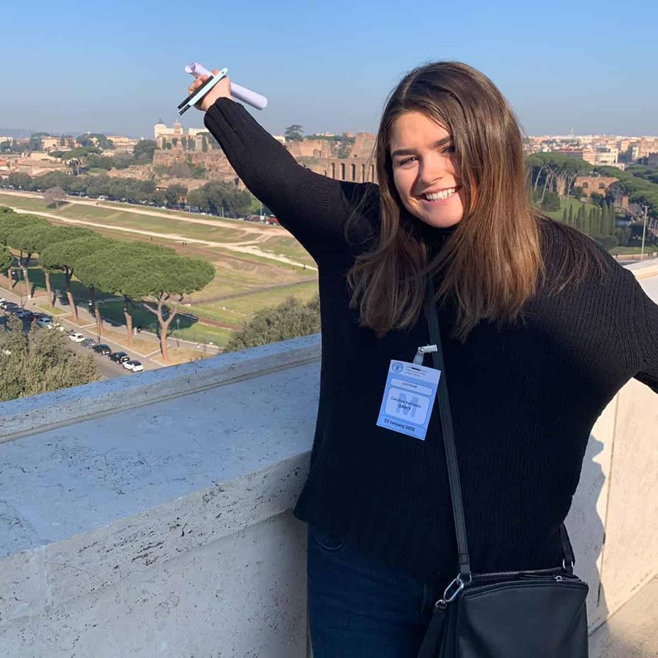
Hi, I’m Caroline. I am a third year college student originally from Syracuse, New York but temporarily transplanted to Rome, Italy. For the next three months I will be continuing my architecture studies in this fantastic city known for its architectural landmarks. In addition to architecture I am interested in graphic design, entrepreneurship and art. I love seeing new things and am ecstatic to be in the midst of my first trip abroad. I am looking to tap outside my comfort zone in terms of experiences but also creatively. As I explore these interests around Europe, I will be sharing my experiences and creations on this blog.
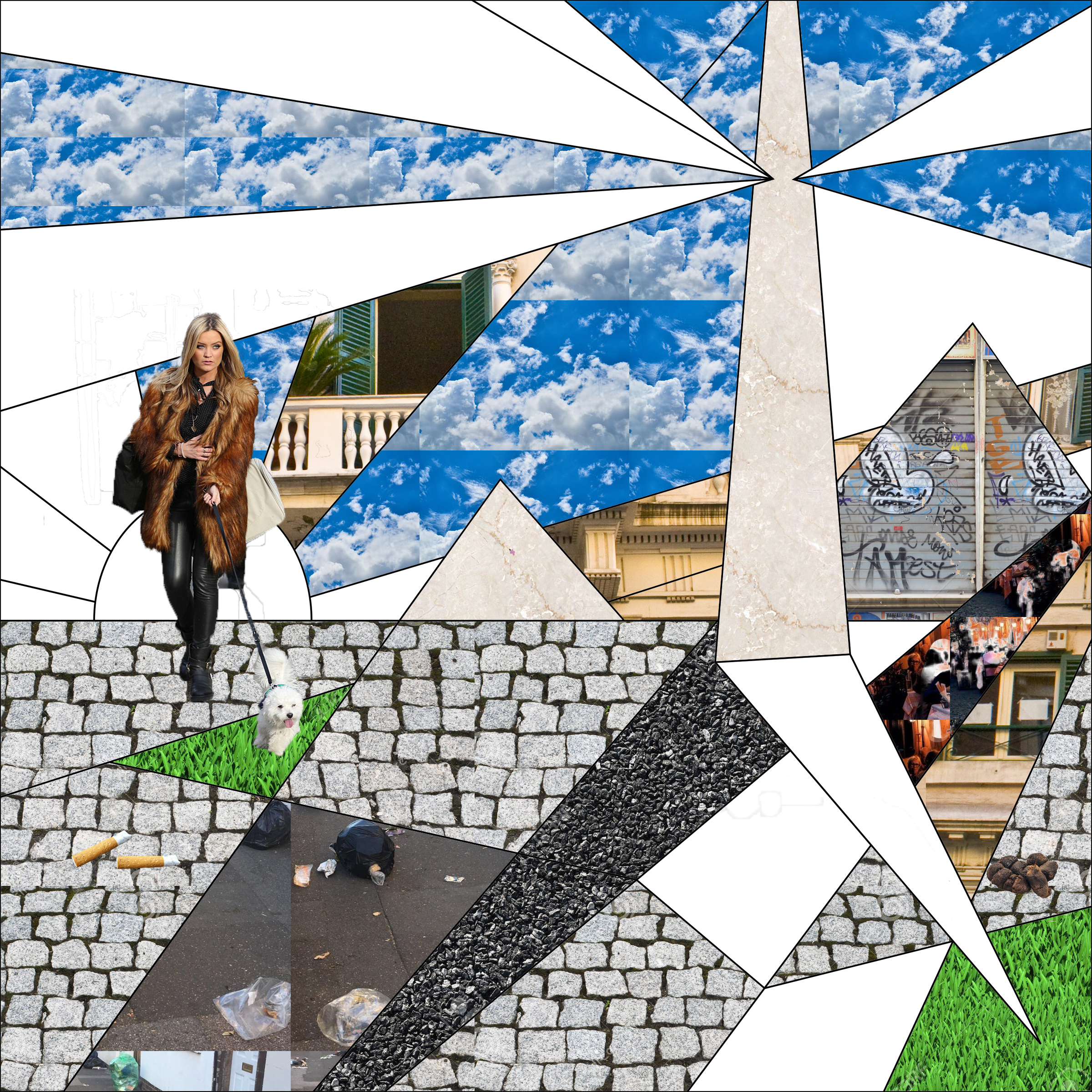
Texture is defined as “the surface quality of a two-dimensional shape or a three-dimensional volume.” Although texture is typically thought to be a feature of three dimensions as something you can both see and feel, it can be simulated in two dimensions. What is known as “visual texture” can be created by using depictions of physical texture. The above creation highlights the visual texture I have seen in Rome. Perhaps one of the most notable textures of Rome are its cobblestone streets. These are no normal streets and sidewalks, not only does each individual stone have its own course texture, the web they create protrudes and undulates in a way that makes it come alive and doesn’t let you forget that you’re walking on it. To me texture isn’t just the look or feel of an individual thing, but when applied to a landscape it is also everything that makes that landscape come alive. Another noticeable “texture” of the streets is the trash that litters them. I use quotations because I don’t consider the texture of the individual pieces of trash, rather the pieces as a whole are the texture of the city that protrudes and alters the surface quality of the streets. Same can be said for the cigarette butts and dog droppings which seem nearly unavoidable on a normal walk in Rome. Typical of a city, very few patches of grass break the stone and asphalt as represented in my abstract rendering.
Moving up from the ground, the distinct textures of the buildings stick in my mind even when they are out of view. The Italian marble, stucco and scalloped, metal doors covered in graffiti makeup the eye-level texture of the city. The people in Rome also add to its “surface quality” and therefore form its texture. Although I knew I wanted to depict these people, I didn’t want it to just be any in descript person. Instead I thought back to the people that really were really memorable. On two occasions I can recount seeing women dressed very stylishly walking with small dogs, seemingly a scene out of The Devil Wears Prada. These women themselves, while adding to the texture of the city were full of texture with their big, furry coats and little, furry dogs.
And finally, that takes us to the sky. Compared to where I come from, Roman skies are almost always sunny and blue even if there are some thick, fluffy clouds in them. The clouds specifically bring an interesting dynamic in terms of texture. Even though they are three-dimensional, we have no way of feeling their physical texture so in a way, clouds, even in real life, have a sort of visual texture quality.
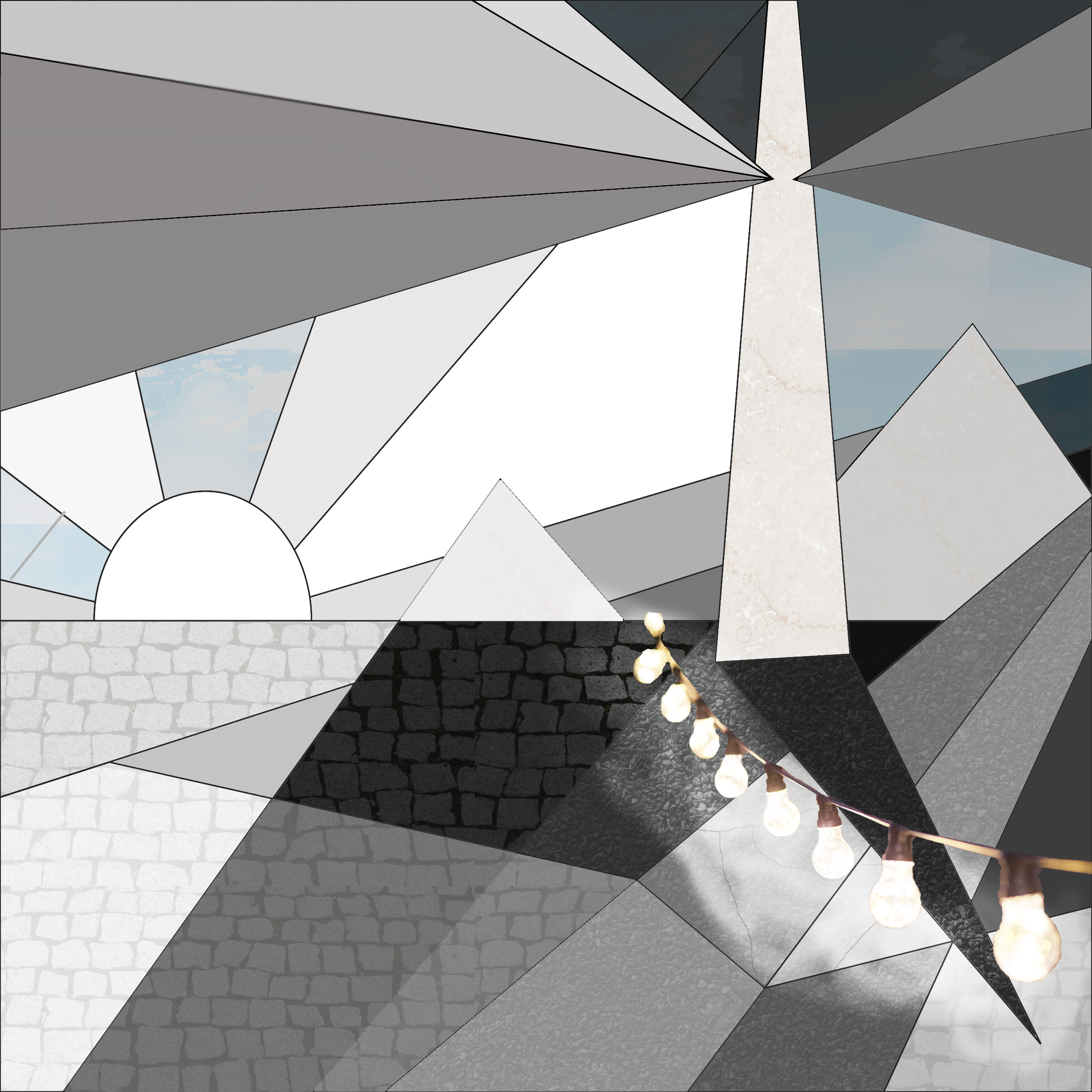
Value
Value is the “relative lightness or darkness of a surface.” Value is not about color, rather it is about the shades of grey between white and black compared to the objects around it. Those areas with a direct source of light are a pure white which fades as an object or a piece of an object receives less and less direct lights. In the rendering above, I used tones of grey to depict the way the sun and other light sources distribute value across a city. The center of the sun and some of its rays are pure white being that this is the strongest source of light outside during the day; there is nothing else brighter than it and therefore it has the lightest relative value. In my design there are three main shapes that rise directly from the ground; I took these forms to represent the buildings in a cityscape. Although buildings may sometimes have cast shadows from other adjacent buildings, I made these representations each varying light shades of grey to depict the direct light that many buildings receive during the day, especially when the sun is high.
In my depiction, I thought of the horizontal pieces as the clouds in the sky. Although we see clouds to be white in color, they are darker comparatively to the bright rays of sunshine. This is why they appear to be shades of grey rather than pure white in my design. Being that the main light source is on the left side of the picture, the right side is inherently darker comparatively. Instead of viewing it as simply a shaded portion of the picture, I decided to transform it into its own nightscape with its own source of light. The skies and ground are darker but different shades of grey and black show the different values even in the nighttime. In the nightscape the cobblestone and asphalt ground is darker than it is in the sun, but even so, shadows can still be seen with deep black tones that are darker relative to the surrounding colors. The relative dark value of shadows allows us to view areas of lightness around them and visa versa. In other words, you can’t see lightness without relative darkness or darkness without relative lightness.
While the sun is the main light source for the city during the day, this does not mean the city goes completely dark at night. Streetlights and big-bulbed string lights from restaurant fronts light up the city. I incorporated these string lights into my design because it is something that is very visually pleasing to me during the nights in Rome. These individually lit restaurants don’t provide light that is all that strong, but they do enough cast a soft glow around the small area surrounding their establishment. I attempted to capture this glow in my rendering by lightening some of the darkness just under the lights with soft edges.
Finally, I included some simple opaque patterns to present my understanding of value in a more convincing way. The subtle hints of texture allow the viewer to digest what they are seeing as a landscape. Then, with preconceived notions of how light diffuses in a city they can better understand my abstractions. Although I included some light blue hues, I refrained from using other vibrant colors like green grass that could distract from the viewers perception of light and dark.
Shapes and Geometry
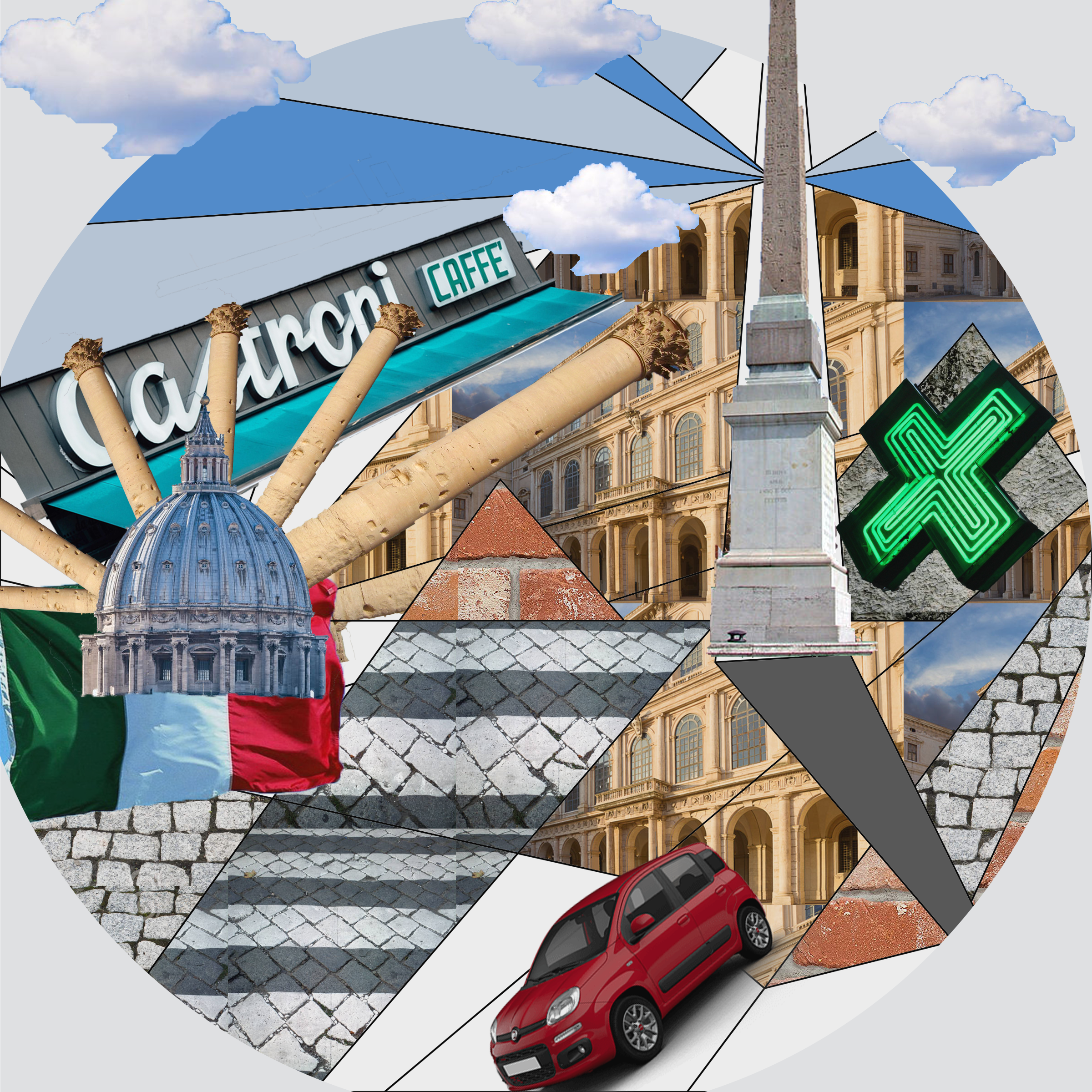
A shape is created when a line encloses an area. Simple shapes like squares, rectangles, circles and triangles and their three-dimensional counterparts can be seen in different scenes we encounter every day. In my collage depicting shapes and geometry I took a different much less organized approach than I did in my previous designs. While values and textures are inherently understood as “fills” of color or pattern, I struggled to figure out how I would depict shapes in this same way. Instead, I decided to “paint” with shapes, using the general guidelines of the pre-existing shapes. I began by filling the sun shape with the dome of St. Peter’s Basilica at the center and classical Roman columns as its “rays.” Next, I saw the tall triangular shape that jutted up into the sky as a traditional Roman Obelisk which can be seen all over the city. I filled some of the sections that rise from the ground with pictures of a typical Roman building with many arches above the windows and doors. These all provide examples of how much geometry is incorporated in Roman architecture across different ages. To accompany examples of geometry in architecture, I incorporated many more modern shapes that complement the city. For example, the shape of the small, rounded cars stand out to someone like me, from Upstate New York who is used to seeing pickup trucks and SUV’s. The rectangular “Castroni Cafe” sign, larger than any other around it and the lit up, green pharmacy signs also bring an element of noticeable geometry (and associated order) to the seemingly chaotic city. Curvilinear clouds break up the bright blue background, carrying the sense of geometry from the streets to the sky. Other curvilinear shapes such as the arches, the rounded columns and St. Peter’s Dome add dimension to the rectilinear buildings and street grid. In this design I chose to accentuate the rectilinear by creating a circular canvas. Art is not only defined by the shapes inside it, but the shape of the canvas has the greatest power in affecting the composition of the piece.